

Turning Photos Into Wall Art: Stunning Ideas & Tips
Turning one of your favorite photos into a piece of wall art is such a simple way to bring your personality into a room. It’s all about picking a great, high-resolution shot, deciding on a material like canvas or metal, and then ordering a custom print. You're literally turning a digital memory into something you can see and touch every day. And honestly, it's easier now than it's ever been.
Why Your Photos Belong on the Wall, Not Just on Your Phone
Let's face it—a truly great photo shouldn't be trapped on your phone or buried in a folder on your computer. Displaying your best memories is a fantastic way to celebrate the people and places that mean the most to you. It’s how you make a house feel like your home, filling it with personal stories instead of generic, store-bought decor.
This isn't just a niche hobby; it's part of a huge shift toward more personalized home design. The global wall art market is absolutely massive, showing just how much people want decor that feels custom. The market for personalized prints and other wall art was valued at around USD 68.9 billion in 2025 and is expected to hit nearly USD 130.2 billion by 2035. You can dig into the numbers yourself in the full report from Future Market Insights.
The Real Payoff of Personalized Art
Choosing to turn your own photos into wall art is about more than just filling an empty space. It's a small investment that pays off big time in your home's overall feel and even your own well-being.
- A Daily Dose of Happiness: Every time you see that piece, you get a little reminder of a great memory—a family trip, your wedding day, or just a silly moment with your pet.
- A Story for Every Visitor: A beautiful, personal photo is an instant conversation starter. Guests will naturally ask about it, giving you a chance to share the story behind the shot.
- You're the Creative Director: You get to pick everything: the photo, the size, the material, and the frame. This puts you in complete control, ensuring the final piece fits your style and space perfectly.
- Gallery-Quality Without the Gallery Price: Thanks to modern printing services, getting professional-looking art is surprisingly affordable. You don't need a massive budget to create something stunning.
In this guide, we’ll walk through the whole process together. We’ll start with how to pick the perfect photo right from your camera roll and go all the way to hanging the finished piece on your wall. I’ll break down all the technical stuff and share some insider tips to make sure your photo looks absolutely incredible.
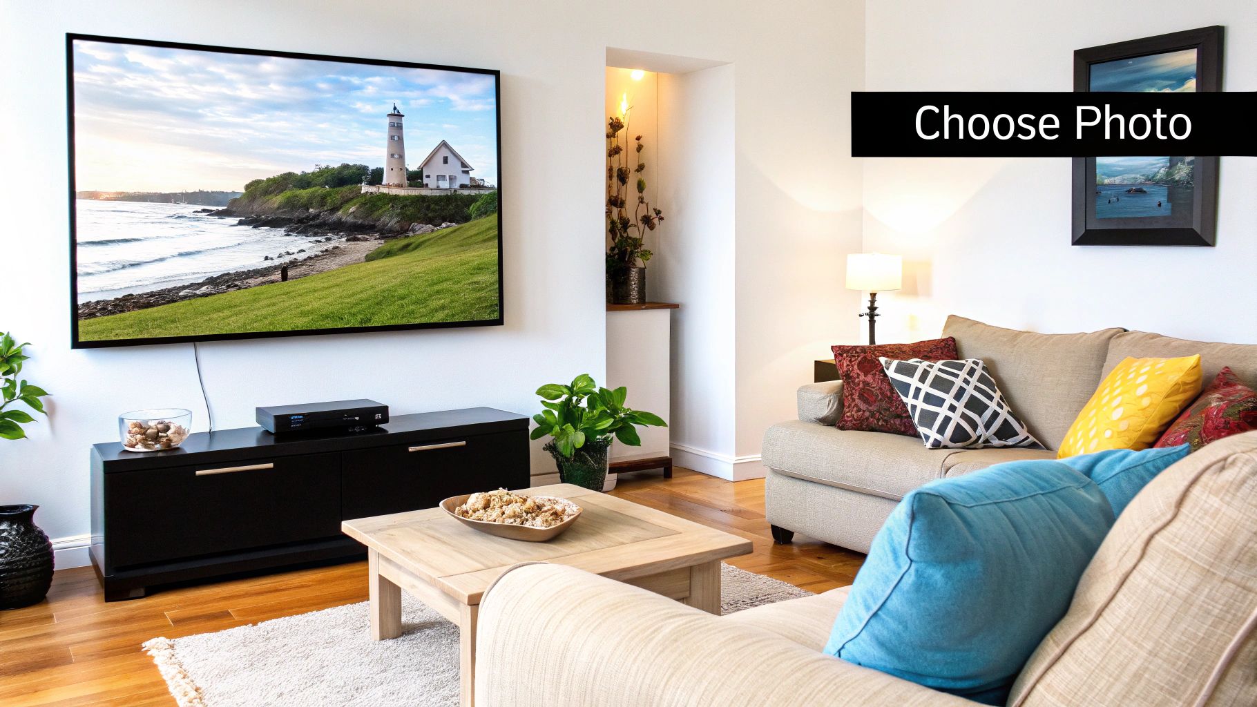
Find the Right Photo for Your Wall
The secret to creating truly stunning wall art from your photos starts way before you think about frames or materials. It all comes down to choosing the right image—one with both the emotional resonance and the technical chops to look incredible when printed large.
It's a common trap: a photo looks fantastic on your phone, so you assume it'll make a great print. But that’s not always the case.
One of the biggest mistakes I see people make is grabbing a photo they saved from social media. Those sites compress images to save space, which strips out a ton of the data needed for a sharp print. So, rule number one: always, always use the original, full-resolution file from your camera or phone. Anything else is a recipe for a blurry, pixelated mess.
Decoding Technical Quality
When you get into printing, two things really matter: resolution and file type. Resolution is measured in DPI, or dots per inch. This number basically tells the printer how much detail to pack into every square inch of the paper.
For a print that looks crisp and professional, you're aiming for 300 DPI at the size you want to print.
Think of it this way: more dots create a smooth, detailed picture, while too few dots make the image look blocky and fuzzy once it’s blown up. Most modern smartphones shoot with plenty of resolution for common print sizes, but it’s definitely something to double-check if you’re planning a large statement piece. If you want to dive deeper into the technical side, our guide on printing photos from Instagram breaks down how social media compression can affect your final print.
Key Takeaway: Start with the highest-quality file you have. Most good printing services will flag an image if the resolution is too low for your chosen size, but using the original file from the get-go saves you the headache.
Beyond the Pixels: Creative Selection
Okay, once you've got a high-quality file, it's time for the fun part—thinking like an artist. The best wall art doesn't just look good; it tells a story or makes you feel something.
Look for photos that have that special something.
- Strong Composition: Does your eye know where to look? A simple, focused subject almost always makes a bigger impact than a busy, cluttered scene. The classic "rule of thirds" is a great guideline here.
- Beautiful Lighting: Light can make or break a photo. That soft, warm glow during the "golden hour" (right after sunrise or before sunset) is pure magic for portraits and landscapes. Try to avoid the harsh shadows of midday sun or dark, grainy indoor shots unless you're going for a specific moody vibe.
- Genuine Emotion: The photos we connect with most are the ones that capture a real moment. A candid laugh, a quiet moment of reflection, the beautiful chaos of family life—these are the images that make for truly personal and compelling art. Forget the perfect poses.
Your goal is to find a picture that doesn't just look good, but feels right. It should be a moment you want to relive every time you walk by it. That’s how you turn a simple photo into art that's all yours.
Simple Edits That Make a Big Difference
You really don't need to be a pro editor to make a photo look incredible on your wall. A few small, smart adjustments can take a picture you love and turn it into something truly special. The idea isn't to completely change the photo, but to polish it and bring out its best features for printing.
Most editing software, even the free stuff on your phone or computer, has everything you need. We're just talking about fine-tuning what's already there. The trick is to make a few subtle changes that, when combined, create a much more vibrant and finished-looking image.
Nail the Composition with Smart Cropping
Before you even think about color or brightness, take a hard look at the composition. Cropping is probably the most powerful tool you have for turning a good photo into great wall art because it lets you completely reframe the story.
Got something distracting in the background? Crop it out. Is the main subject a little too small or weirdly off-center? A tighter crop can bring them front and center.
Don't be afraid to experiment with different shapes, either. A standard landscape shot might suddenly feel more epic as a wide panorama or more focused as a square. Just play around with it until the balance feels right and your subject really commands attention. This one move can make a snapshot look like it was framed by a professional.
A word of caution: it's easy to get carried away and "over-crop." If you cut too much, you might lose too much resolution for a decent-sized print. Always work on a copy of your photo, so you can backtrack if you get a little too aggressive with the crop tool.
Adjusting Light and Shadow for Depth
Okay, now let's talk about light. So many photos can be instantly improved by tweaking their brightness and contrast. These two settings are a team—they work together to give your image depth and make it pop off the wall.
- Brightness: This slider controls how light or dark the entire picture is. If your photo feels a bit gloomy, just nudge the brightness up until it looks clear and natural. Simple.
- Contrast: This adjusts the gap between the darkest and brightest parts of the image. Bumping up the contrast makes the darks darker and the lights lighter, which adds a fantastic sense of dimension.
Here's a look at the editing panel in Adobe Lightroom, a go-to tool for this kind of work.
You can see how straightforward it is. Those sliders on the right for exposure (another word for brightness), contrast, highlights, and shadows give you pinpoint control over the photo's lighting.
Enhancing Color Without Overdoing It
Last but not least: color. The goal here is to make the colors feel rich and true-to-life, not fake and oversaturated. Two key sliders will be your best friends.
Saturation controls the intensity of all the colors in your picture. A little boost can make a landscape look more vibrant, but go easy. Too much saturation is the number one giveaway of an over-edited photo, leading to weird skin tones and almost neon-looking colors.
Vibrance is like a smarter, more subtle version of saturation. It tends to boost the more muted colors while leaving the already-strong ones alone. This is a lifesaver for photos with people in them, as it helps you avoid that dreaded orange-skin look. If you're editing a portrait, vibrance is almost always the better first choice.
A light touch is really all you need. Once you get the hang of these simple edits, you’ll be able to give any photo the visual punch it needs to shine as a beautiful piece of art on your wall.
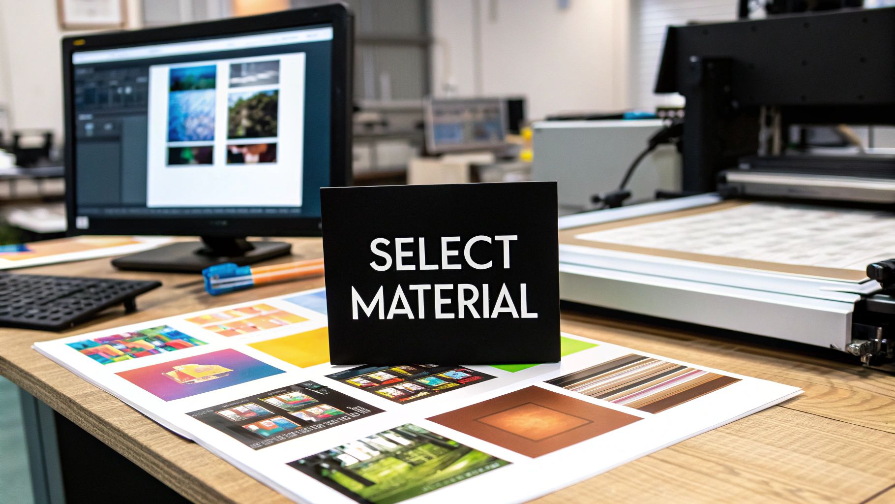
Choosing the Best Material for Your Photo
The material you choose is just as important as the photo itself. It’s what transforms a digital file on your screen into a tangible piece of art for your home. The right choice can elevate an image, while the wrong one can make it fall flat.
Think of it this way: the material sets the mood. A textured canvas can give a family portrait a soft, painterly feel. A sleek, glossy metal print can make a landscape's colors pop with almost electric vibrancy. Each option has its own personality, and the trick is finding the one that matches both your photo and your space.
People are really leaning into custom art to make their homes feel unique. In fact, the market for pieces like custom canvas and framed prints was valued at around USD 5 billion in 2025 and is expected to hit nearly USD 8 billion by 2033. You can dig into the numbers yourself in the full wall art market analysis from Data Insights Market.
The Timeless Appeal of Canvas Prints
There's a reason canvas is a classic. Its subtle woven texture adds warmth and depth, taking the digital edge off a photo and giving it a more classic, artistic quality. It's a very forgiving material that works for a huge range of images.
A gallery-wrapped canvas is a particularly great option. The image wraps right around the wooden frame, so you get a clean, finished look without needing to buy a separate frame. It’s ready to hang straight out of the box.
- Best For: Family portraits, wedding photos, and scenic landscapes. The texture really enhances softer, more emotional images.
- Style Match: It’s a chameleon. It fits in everywhere, from cozy, rustic homes to modern farmhouse decor.
- Key Benefit: The matte finish means no annoying glare. You can hang it in a sunny room and see it perfectly from any angle. If you're thinking big, our guide on choosing the right custom canvas size has some great tips.
The Modern Edge of Metal and Acrylic Prints
If you're after a high-impact, contemporary vibe, look no further than metal or acrylic. Metal prints are made by infusing dye directly into a sheet of aluminum, and the result is stunning. The colors are incredibly vibrant, and the detail is razor-sharp.
Acrylic prints create an even more dramatic sense of depth. Your photo is mounted behind a thick, polished piece of acrylic that makes colors look richer and almost three-dimensional. Both are fantastic frameless options for a clean, modern aesthetic.
Expert Tip: I often recommend metal prints for busy parts of the house, like kitchens or hallways. They're surprisingly lightweight, but they’re also resistant to moisture and scratches, so they hold up beautifully where a traditional print might not.
The Classic Elegance of Framed Prints
You can’t go wrong with a traditional framed print. A good frame is more than just protection; it's the finishing touch that ties the art to the rest of your room. With all the combinations of frames, matboards, and print finishes, the customization possibilities are practically endless.
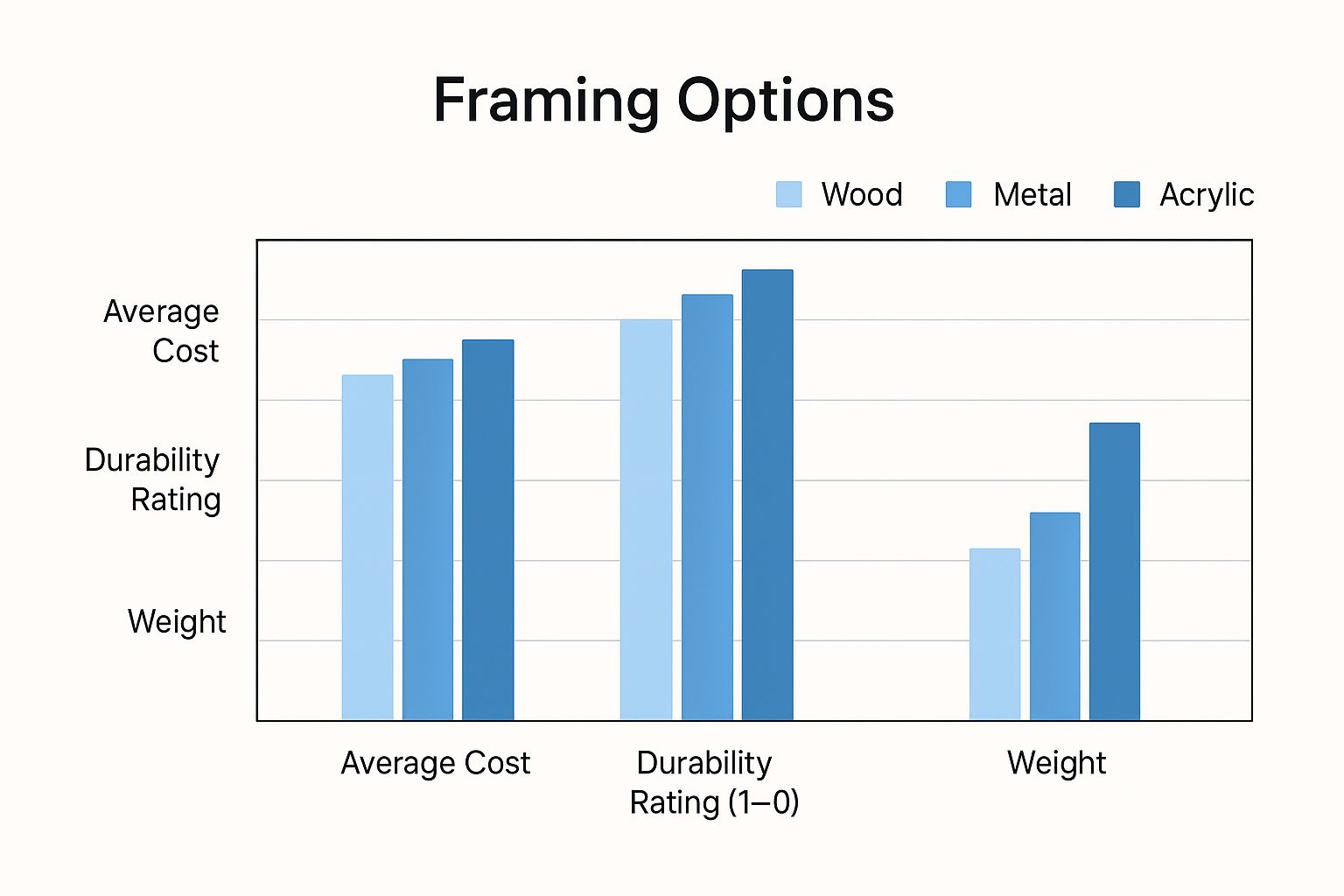
Wall Art Material Comparison
Choosing between these fantastic options can be tough. I've put together this quick comparison to help you see how the most popular materials stack up against each other based on their look, durability, and cost.
| Material | Visual Style | Best For | Durability | Price Point |
|---|---|---|---|---|
| Canvas | Soft, textured, artistic | Portraits, landscapes, traditional decor | Good | $$ |
| Metal | Vibrant, glossy, modern | High-contrast photos, contemporary spaces | Excellent | $$$ |
| Acrylic | Deep, luminous, high-end | Bold colors, statement pieces | Excellent | $$$$ |
| Framed Paper | Classic, versatile, traditional | Any photo, highly customizable decor | Varies (with glass) | $-$$$ |
Ultimately, there's no single "best" material—only what's best for your photo and your home. Whether you choose the warm, inviting texture of canvas or the sleek, modern finish of metal, picking the right material is the final creative step in bringing your memory to life.
How to Hang Your Art Like a Pro
Your custom print has finally arrived. Now for the fun part—turning that beautiful piece into a true centerpiece in your home. The way you hang your art can completely change the vibe of a room, transforming it from just a space into a personal, curated gallery.
The 57-Inch Rule
Here's the most important tip I can give you, and it’s surprisingly simple: hang your art at eye level. Galleries and museums all over the world follow this standard. For most homes, this means the very center of the artwork should be about 57 inches from the floor. This puts the art right in the average person's line of sight, making it feel perfectly placed and comfortable to view.
Of course, this is a starting point, not a strict law. If you're hanging a piece above a sofa, a headboard, or a console table, you'll want to create a visual connection. A good rule of thumb is to leave about 6-8 inches of breathing room between the bottom of the frame and the top of the furniture. This little gap makes the art and the furniture look like a single, cohesive unit instead of two separate objects floating on the wall.
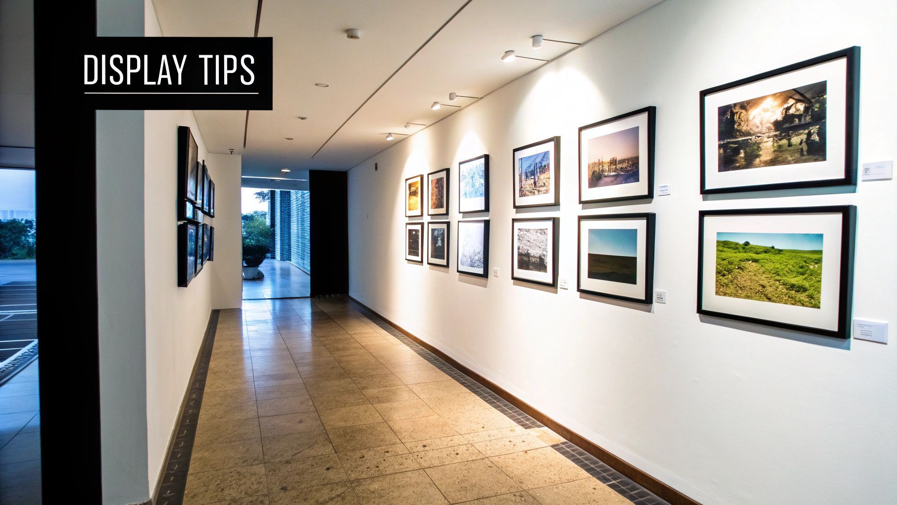
Nailing the Gallery Wall
If one piece is good, a whole wall of them is even better, right? Creating a gallery wall is an amazing way to display multiple photos, but the key is balance, not perfect symmetry. Before you even think about grabbing a hammer, lay out all your framed prints on the floor. This is your chance to play around with arrangements without committing to a bunch of holes in the wall.
- Find Your Anchor: Start with your largest or most impactful piece. Don't stick it right in the middle; place it slightly off-center to create a more dynamic look.
- Build Around It: Arrange the smaller pieces around your "hero" photo. The most critical part here is keeping the spacing between the frames consistent—aim for about 2-3 inches apart to keep things looking clean and intentional.
- Mix It Up: Don't feel like everything has to match perfectly. A blend of different frame styles, sizes, and orientations adds so much personality. Combining classic framed canvas prints with sleek, modern frames can look fantastic.
A great gallery wall tells a story. Try grouping photos by a common theme, a color palette, or a specific event. This creates a narrative that flows from one image to the next, making the collection feel truly special.
It's no surprise that creating these personal spaces has become so popular. With more time spent at home recently, people have been investing in their interiors, which has seriously boosted the demand for unique, custom wall art. You can see this trend all over social media, turning personal photo displays into a huge design movement. For a deeper dive, check out these insights on the rise of personalized decor at Fortune Business Insights.
Finally, don't forget about lighting. You don't need to install a fancy gallery-style spotlight. Often, a well-placed floor lamp or natural light from a nearby window is all you need to make your artwork pop. Just be careful with direct sunlight, as it can cause the colors in your prints to fade over time. With these simple tips, you can hang your art with confidence and make sure it looks its absolute best.
Common Questions About Turning Photos Into Wall Art
Getting ready to turn your favorite photos into art for your walls is exciting, but it's totally normal to have a few questions pop up at the last minute. You're definitely not alone.
Let's walk through some of the most common things people ask. Getting these details right will help you move forward with confidence and create a piece you'll be proud to hang.
What Resolution Do I Really Need for a Big Print?
This is the big one, and for good reason—it’s all about getting a sharp, clear print. The gold standard in the printing world is 300 DPI (dots per inch) at the final print size. This is what gives you that gallery-quality look where every detail is crisp, even when you're standing right next to it.
So, what does that mean in practice? If you're dreaming of a 16x20 inch print, your photo file needs to be at least 4800x6000 pixels. That might sound like a huge number, but don't worry—most modern smartphones can easily capture images at that resolution or higher.
But here's a little insider tip: you can often get away with less. For a really large piece that's going to hang on a big wall and be seen from a distance, you can get an amazing result with as little as 150 DPI. From a few feet back, the human eye won't notice the difference.
The Most Important Rule: Always, always use your original, full-size image file. Never grab a version from social media or one that's been sent through a messaging app. Those services crush the file size, and all that crucial detail you need for a good print gets lost forever.
Should I Choose a Matte or a Glossy Finish?
The finish you pick can completely change the vibe of your photo. There isn't a single "best" choice, just the best choice for your photo and your space.
Here’s a quick rundown to make the decision easier:
- Glossy Finish: Think vibrant, punchy, and high-energy. A glossy surface makes colors pop and gives your photo a slick, modern feel. It’s perfect for colorful landscapes or dynamic city shots. The only catch? Glare. It's not the best option for a spot that gets a lot of direct light.
- Matte Finish: A matte surface is all about a softer, more artistic, and sophisticated feel. It has zero reflection, which makes it ideal for portraits (it's very kind to skin tones!), black-and-white images, or any piece you want to hang in a bright room.
You'll also see "lustre" or "satin" options from many printers. This is a fantastic middle-of-the-road choice. It gives you much of the color vibrancy of a glossy print but with way less glare, making it a safe and popular bet for almost any photo.
Can I Use a Phone Photo for Large Wall Art?
Yes, absolutely! The old myth that phone pictures aren't good enough for printing is just that—a myth. The cameras packed into smartphones these days are incredibly powerful. You can easily create beautiful prints up to 16x20 inches, and often even larger, from a phone photo.
The key is the same as before: use the original, unedited file straight from your phone. Don't text it to yourself or pull it from an online post. Transfer the full-resolution file directly to your computer or upload it from your phone's gallery.
Most good printing services have a built-in safety net. When you upload your photo and select a size, their website will analyze your file. If your image resolution is too low for the size you want, you'll get a warning. This feature takes all the guesswork out of it and ensures you won't be disappointed with the final result.
Ready to transform your favorite memories into beautiful, lasting art? At everone, we make it simple to create high-quality, personalized canvas prints and posters that you'll cherish for a lifetime. Start designing your custom piece today at https://everone.shop.
Article created using Outrank