

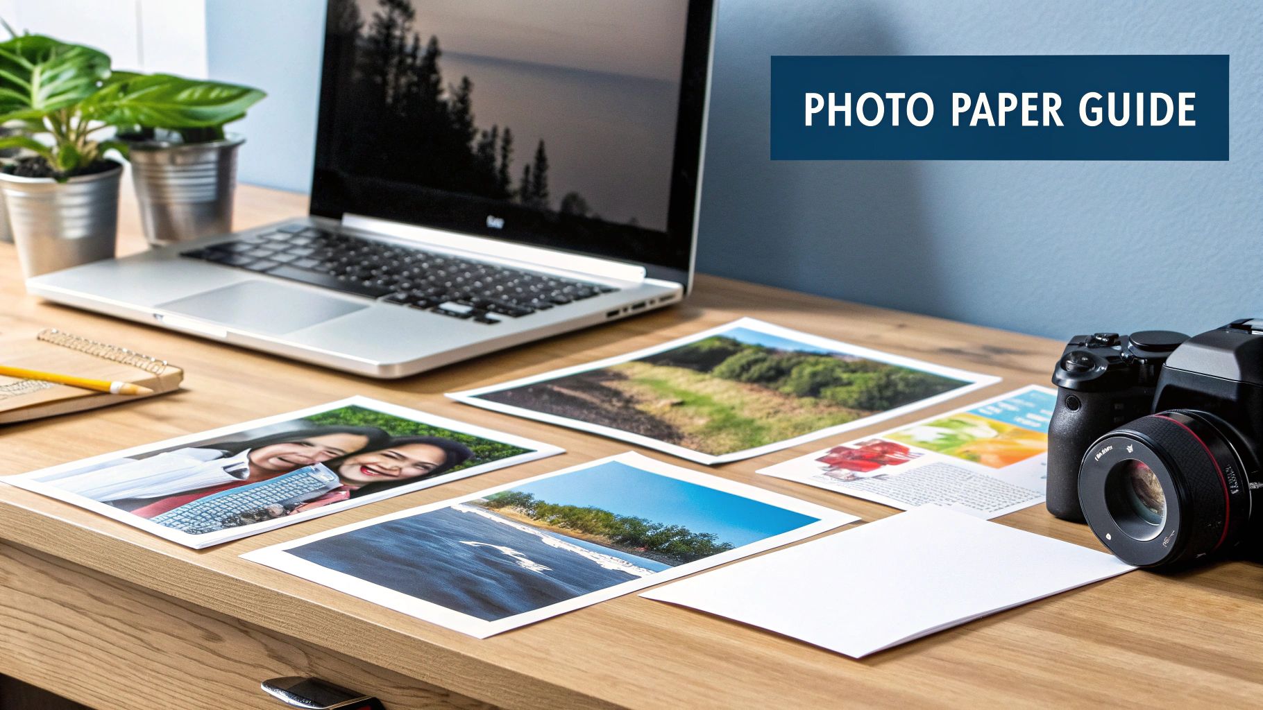
Best Paper for Photo Printing A Practical Guide
If you're after vibrant, eye-catching family photos, I always find that a luster or satin finish is the way to go. It really gives you the best of both worlds—great color saturation without all the annoying glare. For more dramatic, artistic prints that you plan on framing, a high-quality, non-reflective matte paper is unbeatable for its deep tones and sophisticated feel.
Your Quick Guide to Perfect Photo Paper
Choosing the right paper is that final, critical step that brings a digital image to life. It’s what turns pixels on a screen into a real memory you can hold, share, and hang on your wall. You only need to grasp a few core ideas—finish, weight, and brightness—to make a choice that turns simple snapshots into cherished keepsakes.
The feel of a print is just as important as how it looks. This is a big reason why so many people still prefer buying paper in a physical store. In fact, offline sales still dominate with a 68.1% share, which tells you that seeing and touching the paper is a huge part of the experience. And while you can print in any size, the classic 4x6 inch format is still the most popular worldwide, making up 47.2% of all prints. It's just perfect for albums and sharing with friends.
Quick Guide to Common Photo Paper Finishes
To give you a head start, I've put together a little cheat sheet. This table breaks down the most popular paper types and what they're truly good for. Think of it as your guide to matching the right paper to your project.
| Paper Finish | Key Characteristic | Best For | Avoid For |
|---|---|---|---|
| Glossy | Highly reflective, shiny surface that makes colors pop. | Colorful landscapes, commercial shots, and modern photography. | Displaying in brightly lit rooms where the intense glare can be a problem. |
| Matte | A smooth, non-reflective surface with deep blacks and soft tones. | Black-and-white photos, fine art prints, portraits, and anything with a vintage vibe. | Images where you really want that intense color saturation to jump off the page. |
| Luster/Satin | A subtle sheen with a fine texture, offering a professional feel. | Wedding photos, portraits, and everyday prints you'd put in an album. | Situations where you need either an extreme shine or a completely flat finish. |
| Metallic | A glossy finish with a distinctive metallic or pearlescent shimmer. | High-impact images like cityscapes, automotive shots, or abstract art. | Soft, natural portraits where the shimmer might be a bit distracting. |
Ultimately, finding the best paper for photo printing really comes down to what you're printing and where it's going to live. If you're looking for a solid, versatile option for your everyday memories, you can't go wrong with a classic choice like our regular photo print offerings, which deliver consistent, high-quality results every time.
Understanding Core Photo Paper Qualities
To really nail your photo prints, you have to speak the language of paper. It’s about more than just picking a glossy or matte finish; several core qualities truly shape how a photograph looks and feels once it's in your hands. Getting a handle on terms like paper weight, thickness, and brightness is what will let you move past brand names and start making truly informed choices.
These are the specs that make the difference between a flimsy, forgettable snapshot and a professional, gallery-worthy piece of art. They have a direct impact on a print's durability, how accurately the colors pop, and that all-important feeling of quality.
Decoding Paper Weight and Thickness
One of the first things you'll run into is paper weight, which is usually measured in Grams per Square Meter (GSM). Simply put, a higher GSM number means the paper is denser, heavier, and thicker. This extra heft gives a print a more premium, substantial feel and makes it far less likely to curl or bend over time. It’s the difference between a thin flyer and a high-quality postcard.
This graphic breaks down how different GSM values stack up in the real world.

As you can see, jumping from a standard weight to an archival one more than doubles the paper's density. That’s a huge leap in creating a much more durable, lasting print.
The Role of Paper Brightness
Another key player is brightness, which tells you how much light a sheet of paper reflects. A higher brightness level, often rated on a scale of 1-100, means you’re getting a purer, crisper white base. This is what makes colors appear more vibrant and saturated, and it's a big reason why glossy papers are so popular.
The inkjet glossy photo paper market was valued at around $2.5 billion in 2025 and is still growing, largely because people love the vivid, sharp images you get from high-brightness papers. Discover more insights about photo paper market trends.
But brighter isn't always better. For things like portraits or black-and-white photos, an extremely bright paper can sometimes wash out subtle skin tones or delicate gray gradients. In those situations, a paper with a slightly lower brightness level can actually produce a more natural and nuanced result. It's all about finding that perfect balance to match the paper to your photograph's unique character.
Comparing Photo Paper Finishes In Depth
Choosing a paper finish is probably the single most important decision you'll make when printing a photograph. It's what sets the entire mood. The way a paper’s surface catches the light completely changes everything from color vibrancy to the simple act of viewing the print. Finding the best paper isn't about one "perfect" finish; it's about finding the right finish for your image.
The flexibility of today's printing tech is why it's so dominant. The inkjet photo paper market alone makes up over 57.2% of the industry, with a value of around $1.5 billion. That's a huge number, and it's because this technology works brilliantly for everyone from casual hobbyists to seasoned pros. You can read more about the trends in the photo paper market if you're curious.

Glossy Finishes For Maximum Impact
If you want your photo to scream "look at me," glossy is the way to go. It has the highest level of shine, creating prints that feel incredibly sharp and alive. The smooth, coated surface keeps the ink sitting right on top, which gives you those super deep, inky blacks and colors that just explode off the page.
This makes it a fantastic choice for bold, colorful landscapes, commercial product photography, or any modern shot where you want the colors to be the star. The big trade-off? That same reflectivity is its greatest weakness. Put a glossy print under direct light or behind a standard sheet of glass, and the glare can be so distracting it completely hides the details in your photo.
Matte Finishes For Timeless Elegance
At the other end of the spectrum, you have matte paper. It features a soft, non-reflective surface that soaks up light instead of bouncing it back. The result is a much softer image with deep, rich tones and absolutely zero distracting shine.
Matte has long been the favorite for fine art prints, classic black-and-white photos, and portraits that call for a more subtle, textured, and emotional feel. It's also incredibly forgiving when it comes to fingerprints. Just be aware that this softness can make an image feel a tiny bit less sharp than its glossy counterpart, so it’s best suited for photos where mood and texture are more important than tack-sharp detail.
A key takeaway is that the best finish often depends on where the photo will be displayed. A glossy print might look stunning in a photo album but become unviewable due to glare when framed on a wall in a brightly lit room.
Luster and Satin The Professional's Choice
Sitting perfectly between the extremes of glossy and matte, you'll find luster and satin finishes. Think of them as offering a gentle sheen or a soft glow, not a hard reflection. They have a subtle texture that breaks up the light just enough.
This middle ground gives you the best of both worlds: the great color pop of a glossy paper but with way less glare. This makes it an incredibly versatile and popular choice among professional photographers. Plus, it hides fingerprints much better than a glossy finish.
This amazing balance makes luster and satin finishes a great fit for almost anything, including:
- Wedding photos that need rich color and a professional, non-glare look for display.
- Portraits where you want vibrant skin tones without a distracting, plasticky shine.
- Photo albums that will be handled a lot and viewed from different angles.
At the end of the day, this finish delivers a high-end, professional look that works for nearly any photograph, making it a safe and reliable choice when you want top-tier results.
To make the decision easier, let's look at which finish works best for specific types of photography.
Detailed Finish Comparison for Specific Photo Types
| Photography Style | Recommended Finish | Why It Works Best | Considerations |
|---|---|---|---|
| Vibrant Landscapes | Glossy | Maximizes color saturation and detail, making skies pop and foliage look lush. The high contrast adds incredible depth. | Glare can be a major issue if displayed in a bright room or under direct light. Not ideal for framing behind glass. |
| Portraits | Luster or Satin | Offers a perfect balance. It renders skin tones beautifully with a slight sheen but without the distracting reflections of glossy. | For a more artistic or vintage feel, a matte finish can be a more compelling choice. |
| Black & White | Matte | Enhances the tonal range and texture without any distracting sheen. It creates a deep, rich, and timeless feel. | Can slightly soften the sharpest details, which may not be ideal for high-contrast architectural B&W shots. |
| Commercial/Product | Glossy or Luster | Glossy makes products look sharp, modern, and high-value. Luster is a great alternative for reducing glare in studio lighting. | Fingerprints are a constant battle with glossy paper, requiring careful handling during shoots and display. |
| Fine Art/Exhibition | Matte | Its non-reflective surface encourages viewers to focus on the image's composition, texture, and emotional content. | Colors will appear more subdued, which is a stylistic choice that may not suit every artistic vision. |
This table should help guide you toward a finish that not only looks good but also elevates the specific story your photograph is telling. There's no single "best" choice, only the best choice for a particular image and its intended viewing environment.
Matching Paper to Your Printer Technology
Picking the right photo paper is about more than just a glossy or matte finish. You have to match the paper to your printer. It’s a crucial step. If you get it wrong, you’re not just looking at a bad print—you could end up with smudged ink, wasted paper, and maybe even a busted printer. The two main players in home printing, inkjet and laser, work in completely different ways.
Inkjet printers, as the name suggests, spray tiny droplets of liquid ink onto the paper. For a photo to come out looking sharp and vibrant, the paper needs to soak up that ink right away, without letting it spread. That's why photo paper made for inkjets has a special microporous coating. Think of it as a microscopic sponge that instantly absorbs the ink, keeping your lines crisp and your colors from bleeding into each other.
Why You Can't Mix and Match
So what happens if you try to use laser paper in an inkjet? It’s a recipe for disappointment. Laser paper doesn’t have that absorbent coating, so the liquid ink just sits on the surface in little puddles. The result is a muddy, blurry mess.
It all comes down to how the image gets made. Inkjets need paper that can handle liquid ink. Lasers need paper built to withstand heat and static. If you mix them up, you're essentially breaking the printing process.
Now, flipping that around is even worse. Using inkjet paper in a laser printer can be a costly mistake. Laser printers don't use ink; they use a fine powder called toner, which is fused to the paper with intense heat and pressure. The coating on inkjet paper just can’t take that kind of heat. It can literally melt inside your printer, gumming up the fuser and other expensive parts. That’s not a simple fix; you’ll likely be calling a repair technician.
Specialized Printing and Your Printer
This paper-and-printer relationship is vital, especially as you get into more creative projects. Getting your settings right is essential when you’re printing on transfer paper, and it all starts with having the right materials. The same core ideas apply whether you're printing a standard 4x6 photo, making a custom t-shirt, or trying something more ambitious like learning how to print photos on canvas.
The bottom line? Always, always check the package. Make sure the paper you’re buying is specifically made for your type of printer, whether it's inkjet or laser. It’s a simple check that saves you from headaches and protects your gear, ensuring the beautiful image on your screen makes it onto the page.
Choosing Paper for Real-World Printing Projects
It's one thing to talk about paper specs in theory, but where the rubber really meets the road is when you apply that knowledge to an actual project. Picking the right photo paper isn't just about ticking boxes; it's about matching the paper's personality to the photo's purpose. Get it right, and a simple print can become a treasured heirloom or a show-stopping piece of art.
So, let's get practical. Every printing project has a different endgame—maybe it's a family album meant to last for generations, a fine art print for a gallery wall, or just some fun, vibrant prints for a marketing handout. Each of these needs a specific combination of finish, weight, and texture to really shine.
For Durable Family Photo Albums
Think about how a family album gets used. It’s passed around at gatherings, pages are turned by countless hands, and it’s meant to be enjoyed, not kept behind glass. Durability is everything. You need a paper that can stand up to fingerprints and frequent handling without looking worn out after a year.
This is where Luster or Satin paper truly excels. These semi-gloss finishes give you the rich color pop you get from glossy paper but with a subtle texture that does a fantastic job of hiding fingerprints and cutting down on glare. I'd recommend a paper weight of at least 240 GSM to give the photos a substantial, quality feel that resists creasing and tearing.
For Professional Portfolios and Gallery Displays
When your name is on the line, every single detail matters. For a professional portfolio or a gallery exhibition, the paper itself is part of the art. It needs to look and feel sophisticated while guaranteeing the print will last. The whole point is to showcase the image without any distractions.
In this arena, a heavyweight, archival matte or a fine art fiber-based paper is the professional standard. Look for something 300 GSM or heavier; it just has that substantial, museum-quality presence. The completely non-reflective surface of a good matte paper ensures there's zero glare, which allows for incredibly deep blacks and a soft, painterly finish that looks stunning under gallery lights. It's a choice that quietly screams quality and professionalism.
No matter the project, preparing your digital files correctly is just as important as the paper you choose. Before you hit "print," check out these essential artwork submission tips to make sure your results are flawless.
For Vibrant Marketing or Social Media Prints
If you're printing photos for a flyer, a business handout, or just want to bring your best social media posts into the physical world, the objective is simple: grab attention. You need colors that jump off the page and images that are sharp and full of life.
Your go-to choice here is a high-gloss paper. Its slick, reflective surface pushes color saturation to the max, making images look incredibly sharp and vibrant. While it's a poor choice for framing because of the intense glare, it's absolutely perfect for promotional pieces that need to make an instant, powerful impression. If you need a little help turning your online feed into physical prints, our guide on printing photos from Instagram has you covered.
A Few Final Questions About Photo Paper
Even after digging into all the different finishes and weights, you probably still have a few questions rattling around. The world of photo paper is full of jargon that can feel a little intimidating at first, but don't worry. This section is here to clear up those last few uncertainties.
Think of this as your personal FAQ for getting incredible prints every time. We'll tackle the technical stuff and the practical side of things, making sure you feel confident when you hit that "print" button.
What Does GSM Really Mean For Photo Paper?
You've seen "GSM" pop up everywhere, and it’s one of the most important specs to get a handle on. GSM stands for Grams per Square Meter, which is just a fancy way of saying how thick and heavy the paper is. The higher the GSM, the more substantial and durable the paper feels.
Here’s a simple way to think about it:
- 170-200 GSM: This is your go-to for everyday printing. Think snapshots for an album, quick proofs, or fun projects. It’s affordable and gets the job done, but it won’t have that professional heft.
- 240-280 GSM: This is the sweet spot for most high-quality prints. Papers in this range feel solid, resist curling, and look fantastic in a frame. It’s perfect for prints you plan to display or give as gifts.
- 300+ GSM: Now we’re in fine-art territory. This paper is thick, luxurious, and designed to last. It feels significant in your hands and is the undisputed choice for gallery-quality work or family heirlooms.
Simply put, choosing a heavier paper is an easy way to give your most important photos a feeling of quality and permanence.
Can I Use Any Paper Brand With My Printer?
Technically, yes, you can use third-party paper in your printer, but it comes with a catch. Printer companies like Epson, Canon, and HP spend a lot of time and money making sure their own papers, inks, and printers all work together perfectly. Using their branded paper is usually the easiest path to predictable, color-accurate results.
That said, specialty paper makers like Red River and Ilford produce some absolutely stunning papers that can take your prints to the next level. If you decide to explore these options, there’s one step you absolutely cannot skip.
You must download and install the ICC profile for the exact paper you're using. An ICC profile is a small file that tells your printer precisely how to apply ink for that specific paper surface, so your colors come out looking just right. Printing without it is basically flying blind.
What Is Archival Paper And When Do I Need It?
Archival paper is engineered to stand the test of time. To earn the "archival" label, a paper has to be acid-free and lignin-free. These two culprits are what cause standard paper to turn yellow, brittle, and fade over the years. High-quality archival papers, often made from cotton, can easily last for 100 years or more when stored correctly.
So, when should you spring for it? You don't need it for every casual snapshot, but it's a must for any photo you want to preserve for the long haul.
A good rule of thumb:
- Wedding photos? Yes, go archival.
- A beautiful landscape for your wall? Definitely.
- Family portraits you want to pass down? Absolutely.
- Fun prints for the fridge? Regular paper is totally fine.
Archival paper does cost a bit more, but it’s a small price to ensure your most cherished memories are still around for your grandkids to enjoy. If you'd rather leave the printing to the pros, many of the best photo printing services online offer fantastic archival options.
How Should I Store Photo Prints To Protect Them?
Picking the right paper is half the battle—how you store your prints is just as important for making them last. The biggest enemies of a photograph are light, heat, and humidity.
To keep your prints looking as good as the day they were printed, just follow a few simple rules. First, find a cool, dark, and dry place to store them. Attics and basements are usually a bad idea because the temperature and humidity can swing wildly.
Beyond that, here’s how to protect them from damage:
- Use Acid-Free Materials: Always store prints in albums, boxes, or sleeves that are labeled "acid-free." Over time, the chemicals in regular cardboard or plastic can literally eat away at your photos.
- Avoid Direct Sunlight: If you're framing a print, make sure the glass or acrylic offers UV protection. It’s like sunscreen for your photo, blocking the harmful rays that cause colors to fade.
- Handle with Care: Get in the habit of holding prints by the edges. The natural oils on your fingertips can leave permanent smudges and damage the surface.
Taking these small steps will make a huge difference, ensuring the care you put into printing your photos pays off for a lifetime.
At everone prints, we're dedicated to helping you turn your digital memories into lasting works of art with our premium, personalized printing options.