

Turning Pictures Into Wall Art: The Ultimate Guide
There’s something truly special about taking a memory that lives on your phone and turning it into a piece of art for your home. It’s more than just printing a picture; it’s about bringing your favorite moments to life, creating tangible decor that radiates personality and warmth.
Why Your Photos Belong on Your Walls

Let’s face it, most of our best photos are trapped on our phones or buried somewhere in a cloud account. It’s time to set those memories free and give them a place of honor right on your walls.
Putting up your own photographs does so much more than fill a blank space—it injects your home with authentic character. Unlike a generic print from a big-box store, your photos tell a story that’s one-of-a-kind. Every image, whether it's from a chaotic family vacation, a candid moment of laughter, or a peaceful landscape, adds a real layer of warmth to your space.
It's All About Personalization
Making our homes feel uniquely ours isn't just a niche idea; it’s a huge global trend. The wall art market was valued at an incredible USD 63.61 billion in 2024, which just goes to show how many people are choosing to fill their homes with meaningful, personal art. This isn't just about decorating; it's about creating a space that genuinely reflects who we are.
Turning your personal pictures into wall art is one of the most rewarding ways to make a house feel like a home. It’s an instant mood-booster and a constant reminder of the people and places you love.
This simple act transforms your living area into a personal gallery, making every room feel more connected to your story. If you're hunting for some creative ways to get started, our guide on unique wall art ideas has plenty of inspiration for layouts and styles.
Picking a Photo That Will Look Amazing Printed
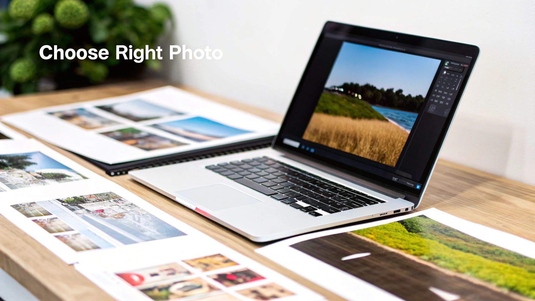
Turning a digital photo into a beautiful piece of art for your home is incredibly rewarding. But let's be honest, not every picture you take is going to look great blown up on a wall. It's about more than just picking a photo you like; we need to dig into what makes an image truly shine once it's printed.
Think about the feeling a photo gives you. That candid shot of the kids laughing might have a tiny bit of motion blur, but it captures a real, joyful moment. On the other hand, you might have a technically perfect landscape that's sharp and well-lit but doesn't stir any emotion. I've found that the photos that tell the best stories often make the most powerful wall art, even if they aren't flawless.
Check the Technicals Before You Print
Before you get too excited and click that "upload" button, a quick tech check is a must. This simple step can be the difference between a stunning print and a pixelated mess. The single most important thing to look at is image resolution. More pixels mean more detail, and that's the key to getting a crisp, clear print.
A common mistake is grabbing a photo from social media. Those images are compressed and just don't have enough data for a large print. Always, always use the original, high-resolution file straight from your camera or phone.
Here are a few other things I always check:
- Focus: Is your main subject sharp? Zoom way in on your computer screen. If it's a portrait, make sure the eyes are crystal clear.
- Lighting: Good light can make or break a photo. Images that are too dark or have harsh, distracting shadows rarely print well. I find that soft, natural light almost always looks best.
- Composition: Look at how the photo is framed. Does it feel balanced and interesting? Using simple guides like the rule of thirds (placing your subject a little off-center) can instantly make a photo more dynamic and artful.
The goal is to find a picture that doesn't just hold a great memory but also has the technical chops to look fantastic at the size you want. Our guide on custom canvas sizes is super helpful for matching your photo's quality to the perfect print dimensions.
The good news is that creating your own prints is easier than ever. Digital platforms have made the whole process, from uploading your photo to ordering the final piece, incredibly straightforward. It's a big reason why e-commerce is changing the wall art market and letting more and more people turn their own memories into professional-looking art.
Simple Photo Edits for a Professional Look
You really don't need to be a professional photographer to give your pictures that polished, print-ready finish. Honestly, a few quick tweaks can take a great snapshot and turn it into a piece of art that truly deserves a spot on your wall. The idea isn't to completely change the image, but to simply bring out its best qualities.
I always start with the composition. The single most powerful edit you can make is often just a simple crop.
Got a distracting element creeping in from the side? Crop it out. This simple action forces the eye to focus right where you want it—on the subject. For instance, with a family portrait, cropping in a bit tighter can remove a messy background, making the whole photo feel more intimate and focused.
Basic Adjustments That Make a Big Difference
After you’ve nailed the framing, it’s time to play with the light and color. You don’t need fancy software for this; the basic editing tools on your phone or free web-based apps like Canva have everything you need. Think of these sliders as your secret weapons for turning pictures into wall art.
-
Brightness & Contrast: A photo that looks a little dark or flat can come alive with a gentle increase in brightness. Bumping up the contrast just a touch will make the details and colors pop, giving it a really crisp, clean feel.
-
Shadows & Highlights: Sometimes, the best parts of a photo are lost in the shadows. Lifting the shadows can reveal all that hidden detail without blowing out the brighter parts of the image. This works wonders on landscape shots where the foreground is a little too dark.
-
Saturation & Vibrance: It’s tempting to crank up the saturation for richer colors, but a little goes a long way! I personally prefer using the vibrance slider. It does a better job of enhancing the more muted colors while leaving skin tones looking natural and not overly orange.
My go-to process is always the same: I crop first to get the composition right. Then, I tweak the brightness and contrast. I finish with a subtle adjustment to the color. This straightforward workflow gets my photos looking sharp and ready to print in just a couple of minutes.
These edits are especially important when you’re planning something bigger, like a custom poster. If you're going that route, you can get more specific advice in our guide on how to make photos into posters, which really dives into getting your images ready for larger formats.
Selecting the Right Print Material for Your Style
Alright, your photo is polished and ready to go. Now for the fun part: picking the material that will bring it to life on your wall. This isn't just about printing; it's about matching the medium to the memory. The material you choose completely changes the final look and feel, so let’s think about what will work best for your picture and your home.
A classic canvas print is always a winner for a timeless, textured feel. Its matte surface is fantastic for portraits and family photos because it cuts down on glare, giving the image a soft, almost painterly quality. Imagine a cozy, modern farmhouse living room—a canvas print of a family beach day would be right at home there.
Looking for something with more punch? Metal prints are sleek, modern, and absolutely stunning. The image is infused right onto a sheet of aluminum, which creates this incredible vibrancy and depth. Honestly, this is my go-to for dramatic landscapes or a super colorful travel shot that you want to be the star of the room.
Before you pull the trigger on a material, this quick flowchart can be a lifesaver. It helps you double-check if your photo is truly print-ready.
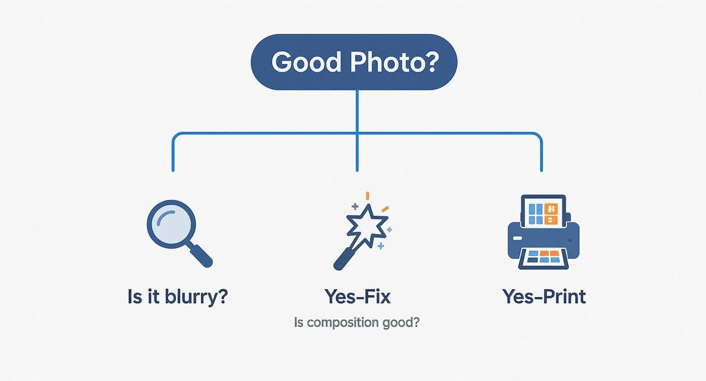
Running through this simple decision tree ensures you're checking for things like blurriness and good composition, so your final piece looks sharp and professional.
Wall Art Material Comparison Guide
Feeling a bit overwhelmed by the options? I get it. This little table breaks down the most popular materials to help you find the perfect fit.
| Material | Best For | Finish | Price Range | Durability |
|---|---|---|---|---|
| Canvas | Portraits, family photos, traditional decor | Matte, textured | $$ | High |
| Metal | Landscapes, travel shots, modern spaces | Glossy, vibrant | $$$ | Very High |
| Acrylic | High-impact art, ultra-modern homes | High-gloss, luminous | $$$$ | Very High |
| Framed Print | Gallery walls, versatile decor styles | Matte or Glossy | $-$$$ | Varies |
Ultimately, the right material comes down to the photo itself and the vibe of your space. Each one tells a slightly different story.
Other Popular Finishes to Consider
Beyond the big two, there are a couple of other fantastic options that might be exactly what you're looking for.
-
Acrylic Prints: These create a jaw-dropping, almost 3D effect. Your photo is mounted behind a thick, polished acrylic sheet, which makes the colors look incredibly rich and luminous. It’s a high-end choice that adds a serious touch of luxury—perfect for a statement piece.
-
Framed Prints: You can never go wrong with a classic. A traditional framed print gives you total control. You get to choose the frame, the matting, and the paper finish to perfectly sync with your decor. This is by far the most versatile option, especially if you're building out a gallery wall.
The material you choose is the final artistic touch. Consider the mood of the photo and the room where it will hang. A vibrant, glossy metal print tells a different story than a soft, matte canvas.
It's no surprise that custom wall art is more popular than ever. The global demand is through the roof, especially with online platforms making it so easy to order personalized prints. If you're curious, you can learn more about the growing wall art market and see just how big this trend has become.
How to Design Your Space and Hang Your Art
https://www.youtube.com/embed/pxvffg4IPbE
Alright, this is the fun part—getting your new art up on the wall where it belongs. A little planning here goes a long way. Trust me, it’s the difference between a professional-looking display and a wall full of misplaced nail holes.
A trick I’ve used for years is to map it out on the floor first. Measure the wall space you’re working with, then use painter's tape to create a matching rectangle on your floor. Now you can play around with your art, arranging and rearranging the pieces until the layout feels just right. Once you land on a composition you love, snap a quick photo on your phone to use as a guide.
Create a Balanced Arrangement
When you're putting together a gallery wall, resist the urge to place your biggest piece dead center. Instead, position it slightly off-center. This creates a more dynamic focal point and helps guide the viewer's eye across the entire collection. From there, place your second-largest piece diagonally from the first to create a sense of balance. Then, you can start filling in the surrounding space with your smaller prints.
Here are a few tips I've picked up over the years:
- Mix Orientations: Don’t just use all vertical or all horizontal photos. Combining both orientations adds a layer of visual texture and keeps the layout from feeling too rigid.
- Vary Your Frames: It’s tempting to match everything, but mixing frame styles and colors can look fantastic. A simple combination of black, white, and natural wood frames almost always works wonders.
- Think Beyond the Rectangle: Who says it has to be all frames? Tossing a round mirror or an unframed piece of fabric into the mix can really break up the straight lines and add personality.
If you’re looking for more layout ideas, our guide on how to arrange pictures on the wall has some great inspiration to get you started.
The one rule I always follow is the "57 inches on center" rule. This just means the center of your artwork (or the center of the entire gallery grouping) should be 57 inches up from the floor. Why? Because that’s the average human eye level.
When it's actually time to hammer in those nails, you want to get it right the first time. For a flawless installation, follow a detailed step-by-step guide to hanging your picture with precision. Always use a level for single pieces, and don't skip the drywall anchors for heavier frames—it’s the key to a secure, beautiful display that will last.
A Few Final Questions Before You Print
You’ve found the perfect photo, picked out your material, and you're this close to clicking the "order" button. But then, a few last-minute questions pop into your head. It happens to everyone!
Let's clear up some of the most common worries I hear about, so you can finalize your wall art with total confidence.
How Big Can I Actually Print My Photo?
This is the big one, isn't it? Everyone worries about their photo turning out blurry. The good news is, the answer is usually simpler than you think.
For a print that looks crisp and professional, the gold standard is 300 DPI (dots per inch) at the final size you want to print. If you don't have fancy software like Adobe Photoshop to check the DPI, don't sweat it. You can just look at the pixel dimensions of your image file.
Here's a handy cheat sheet:
- For a classic 8x10 print: Your photo should be around 2400 x 3000 pixels.
- For a larger 16x20 statement piece: You'll need a bigger file, something closer to 4800 x 6000 pixels.
Most modern smartphones take photos that are more than large enough for small and medium prints. The most important thing to remember? Always use the original file, not a copy you've sent through a messaging app. Any good online printing service will also give you a warning if your image resolution is too low for the size you’ve chosen.
Can I Just Use That Great Picture from My Instagram?
I know it’s tempting, especially when a photo gets a ton of likes. But honestly, it's a bad idea. The short answer is almost always no.
Social media sites like Instagram and Facebook squash your images to save space. They compress them heavily, which strips out a ton of the data that makes a print look good.
What looks sharp on your tiny phone screen will likely become a blurry, pixelated mess when enlarged on a canvas. To get beautiful results you’ll be proud of, you have to track down the original, full-resolution file from your phone’s camera roll or your computer.
Think of a social media photo as a photocopy of your original memory. It captures the essence, but it loses all the fine detail needed for a beautiful print.
Matte vs. Glossy: Which Finish Should I Choose?
This really comes down to personal taste and where the final piece is going to live. There’s no right or wrong answer, but each finish has its own personality.
A glossy finish is all about drama. It makes colors feel richer and more vibrant, and it gives the image a punchy contrast that can be absolutely stunning for colorful travel shots or sweeping landscapes. The only catch is the glare—if you’re hanging it in a room with a lot of bright windows, the reflections can be distracting.
A matte finish, on the other hand, is completely reflection-free. It has a more subtle, sophisticated, fine-art feel. It's my personal favorite for portraits and black-and-white photos, or for any piece you plan to hang in a room that gets a ton of natural light.
Ready to turn those cherished memories into something beautiful for your walls? At everone prints, we make it simple to create high-quality canvas prints and custom posters you’ll love for years. Get started on your project today at https://everone.shop and bring your story home.